
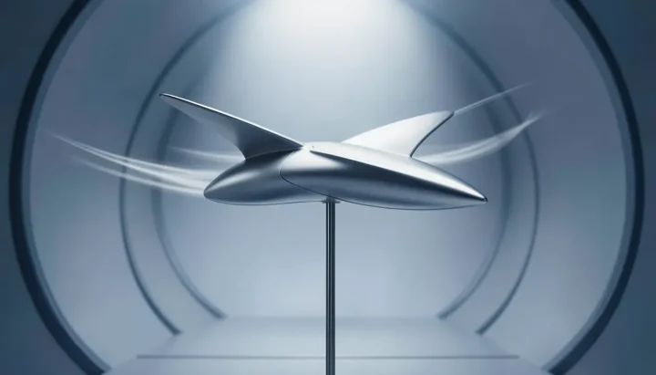
In July 1958, designer James Modarelli stood inside the Ames Unitary Plan Wind Tunnel and examined a radical metallic model engineered for flight at Mach 3.0. According to NASA, the supersonic aircraft model featured a cambered, twisted arrow wing and a distinctive upturned nose designed for high-speed atmospheric research. The striking aerodynamic silhouette deeply impressed Modarelli. At the time, the National Advisory Committee on Aeronautics (NACA) was preparing to transform into a new national space agency, and Modarelli was about to translate that futuristic wing model into one of the world's most recognized visual symbols.
From Cleveland Art Graduate to Research Illustrator
Modarelli began his career at the federal research facility in 1949 after graduating from the Cleveland Institute of Art. Joining the laboratory in Ohio that would later become the NASA Lewis Research Center—now known as the Glenn Research Center—he initially worked as an artist-designer creating illustrations for scientific publications. Over the next decade, Modarelli advanced through the organization's technical graphics departments. By the time NACA began its official transition into NASA between 1958 and 1959, Modarelli held the executive role of Management Services Division Chief at NASA Lewis, leading administrative and visual communications teams.
The Mach 3 Inspiration in the Ames Wind Tunnel
Modarelli's pivotal visual breakthrough took shape during his July 1958 tour of the Ames facility in California. While inspecting testing apparatus inside the Ames Unitary Plan Wind Tunnel, he viewed an experimental Mach 3.0 aircraft model engineered with an upturned nose and a cambered, twisted arrow wing. When NACA leadership invited employees across its laboratories to submit design proposals for the newly forming space agency, Modarelli drew directly upon the aerodynamic geometry he had observed in the wind tunnel, stylizing the radical hypersonic wing as the central vector motif of his artwork.
Translating Supersonic Flight into the NASA Identity
Modarelli submitted the winning artwork for NASA's official seal. Following that success, the executive secretary of NACA asked him to develop a simplified version for informal daily applications. In 1959, Modarelli condensed the official seal into an iconic circular insignia featuring four distinct symbolic elements: a blue sphere representing a planet, white stars representing space, the red vector chevron based on the hypersonic arrow wing, and a white spacecraft on an orbital trajectory around the wing. Completed with white block N-A-S-A lettering across the center, the design became official in 1959.
The Meatball Era, Retirement, and Restoration
Officially designated as the insignia, the circular emblem was not officially nicknamed the "meatball" until 1975, when NASA temporarily retired it in favor of a modern logotype known as the "worm"—a red, stylized rendering of the agency's acronym. Modarelli's circular design remained out of official service for seventeen years until 1992, when NASA Administrator Dan Goldin brought the emblem back to active duty to invoke memories of Apollo-era achievements. In 1992, Administrator Dan Goldin brought Modarelli's original insignia out of retirement, cementing the 1959 arrow-wing chevron as NASA's enduring global mark across modern Artemis launch vehicles and facilities like the 525-foot Vehicle Assembly Building.
AI-generated editorial illustration; not a documentary photograph.
Source: NASA’s “Meatball” Logo
 SIGNAL TITANS
Leave a Reply